RESPONSIVE WEBSITE
The University of Sydney is an Australian public research university with multiple libraries that provide one of the most diverse collection of resources for their students and research professionals.
The challenge
To redevelop their library website with existing framework constraints and deliver a responsive solution while managing third-party database limitations
Approach
Continually engage with various stakeholders to deliver a solution that met the many requirements of multiple internal divisions within the library and university.
My role
I collaborated and shared various UX activities with the UX Lead while leading sketching, journey map development, test participant recruitment, scripting, synthesis, reporting, QA with visual design and development teams during the five month website redevelopment.
My UX activities
• Client/stakeholder management
• Contextual research
• Qualitative/quantitative surveying
• Secondary research
• Card sorting
• Ideation, sketching and iteration
• Information architecture (IA)
• Personas
• Journey maps
• UI collaboration and direction
• Prototyping
• Usability testing
• Synthesis and reporting
• Wireframes
Tools
• Adobe Adobe Creative Suite
• Paper, Post-it Notes and Sharpies
• Sketch 3
• Marvel
• SurveyGizmo
Outcomes
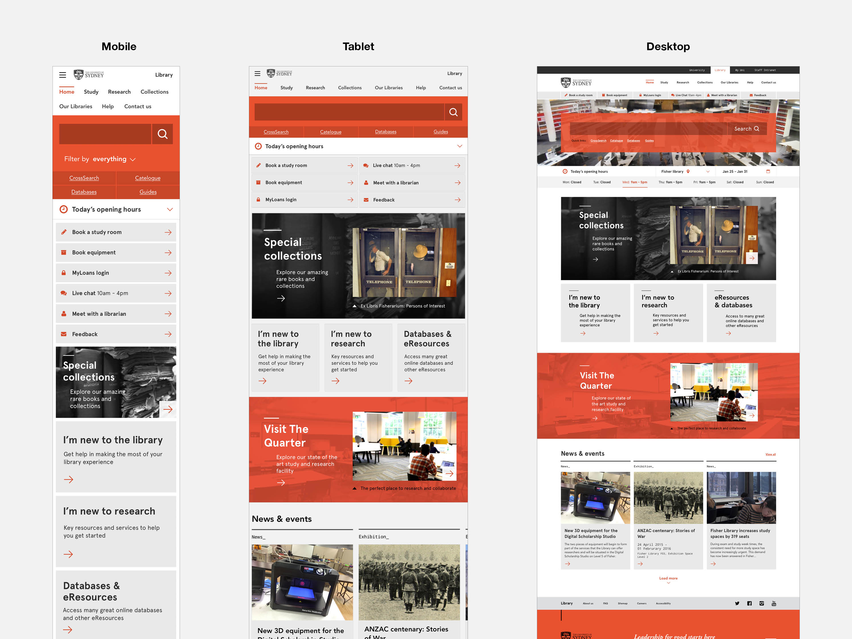
Delivered 18 interface templates (all responsive views) that were integrated, tested and deployed by the Boomworks front and back end development team.
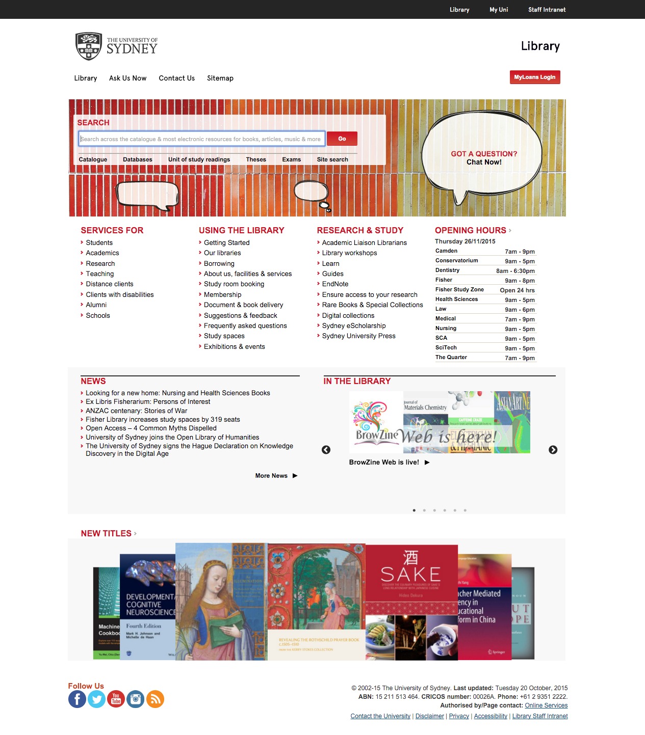
Beginning of a five month journey
Original website in 2015
The library’s website had endured many updates and add-ons through the years. It was content heavy and needed to reflect their recent business transformation of a services model, plus adopt the universities newly branded main site.
Initial engagement with students and stakeholders to identify key goals and expectations
Guerrilla interviews
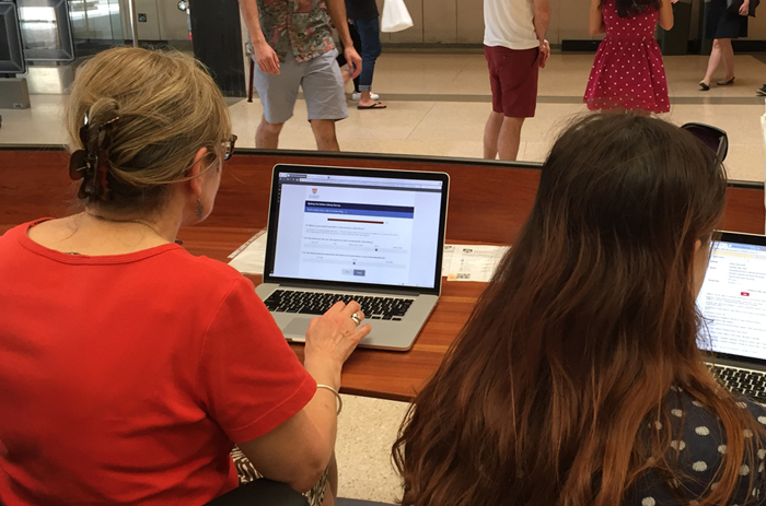
We wanted to gain context and understanding from uni students regarding their needs and current engagement with the library. A day was spent on campus for brief conversations and observations as students utilised the existing library site.
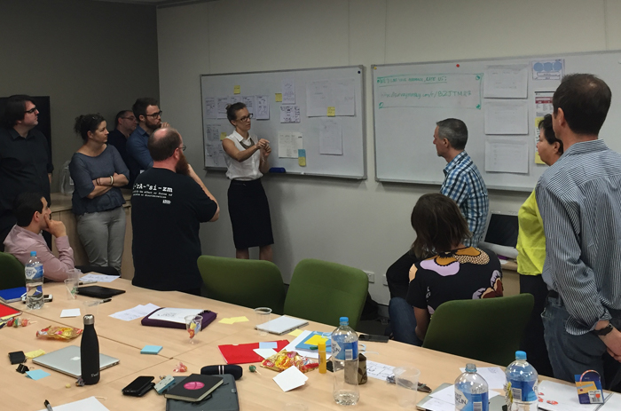
Stakeholder workshops
Workshops were conducted to clearly define goals, align expectations and outcomes across various stakeholders. It helped formalise many parameters including design principles which guided initial sketches through to delivery of the final responsive interface templates.
- Simplified navigation & clear visual hierarchy
- Better Information Architecture (IA) & labelling
- UI enhancements & consistency
- Display critical information transparently
One of the core takeaways from both students and stakeholders was the importance of elevating and accessing key library services
Initial research informing future UX activities and artefacts
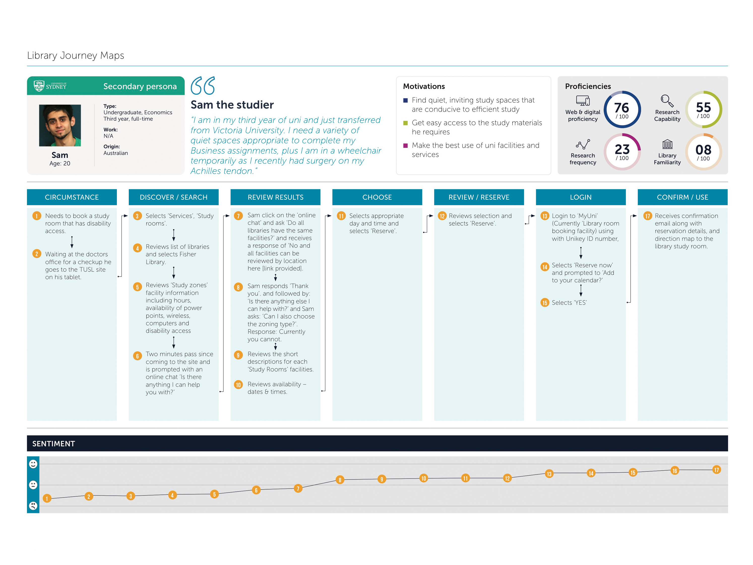
Persona and journey development
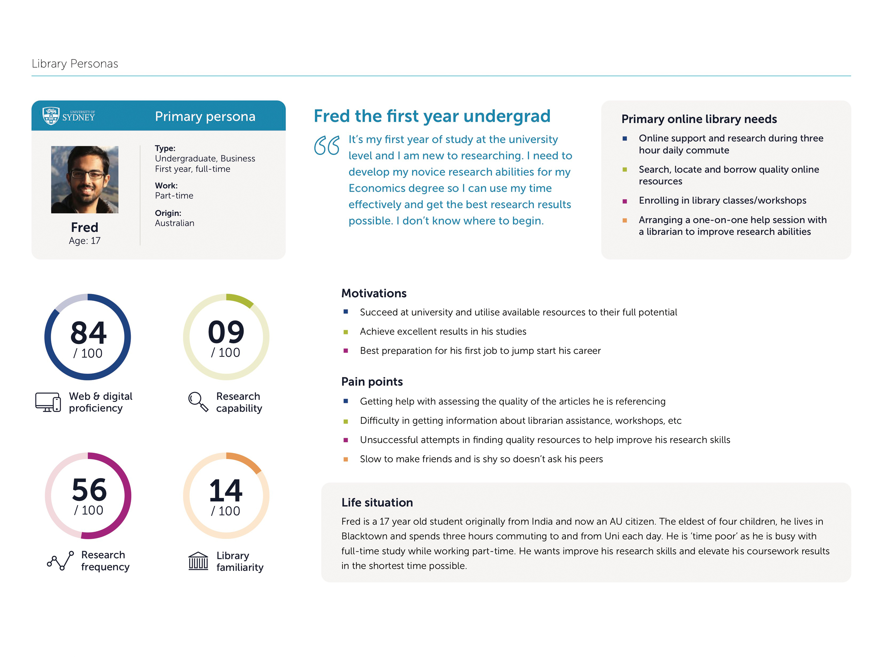
18 existing personas were provided by The University of Sydney Library. Relevant specifics were extracted and integrated with the findings from our initial student engagement. Six personas (three primary and three secondary) were created to represent a wide range of students and researchers that identified key specifics including goals, needs, motivations and pain points.
Additionally, six journey maps (one for each persona) were developed and tracked the ‘ideal state’ to inform the next phase of ideation and sketching.
Informed designs focused on a mobile first approach
Fast iterative flows
It was clear from our initial engagement that the preferred 'go to' device for students was their mobile phone. So the initial design process focused on a mobile first approach to elevate primary contextual task that students performed on a daily basis e.g. book a study room, loans login, live chat. This was one of the core findings of both engagement with students and stakeholders – elevation and access to key library services.
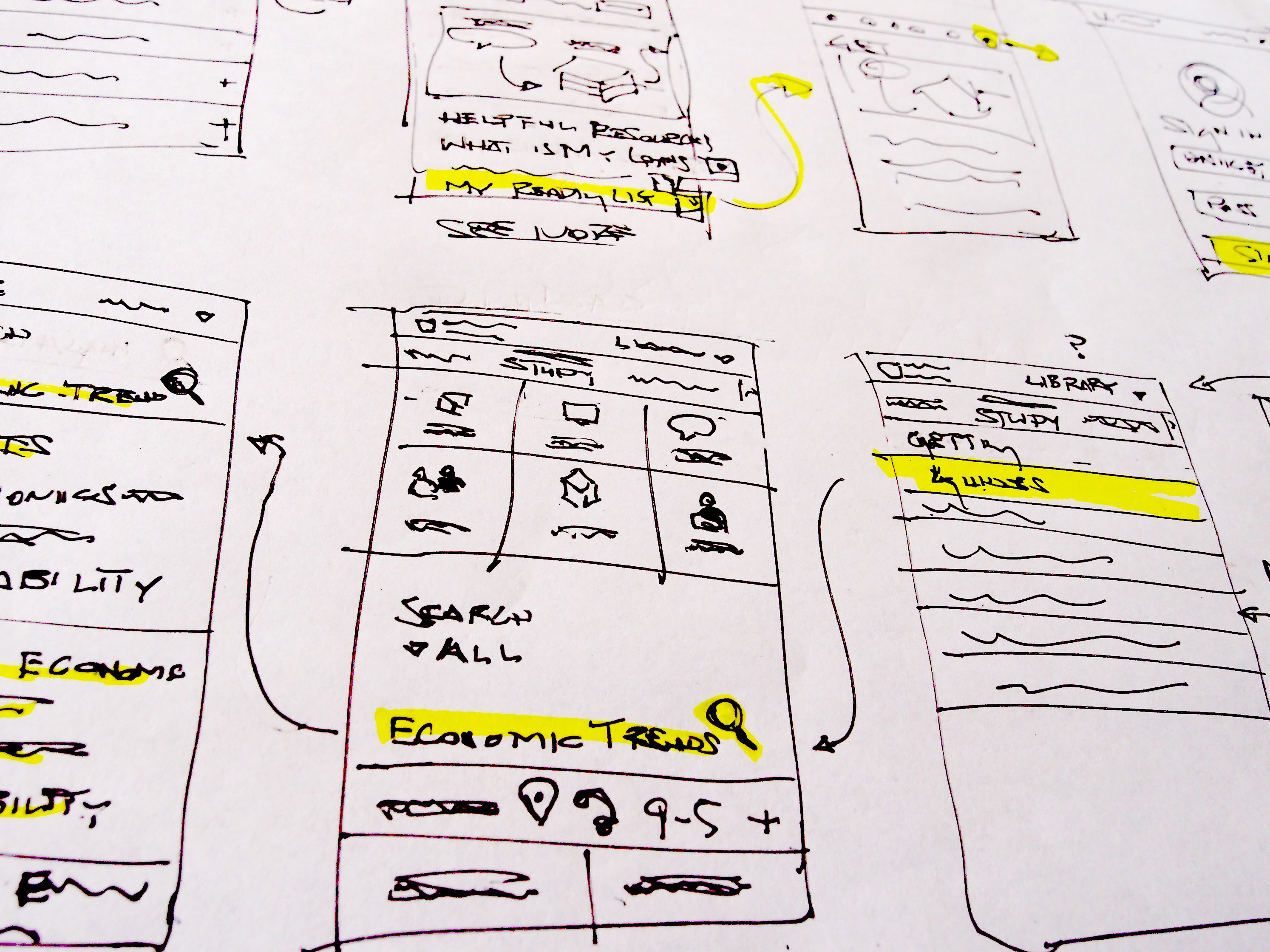
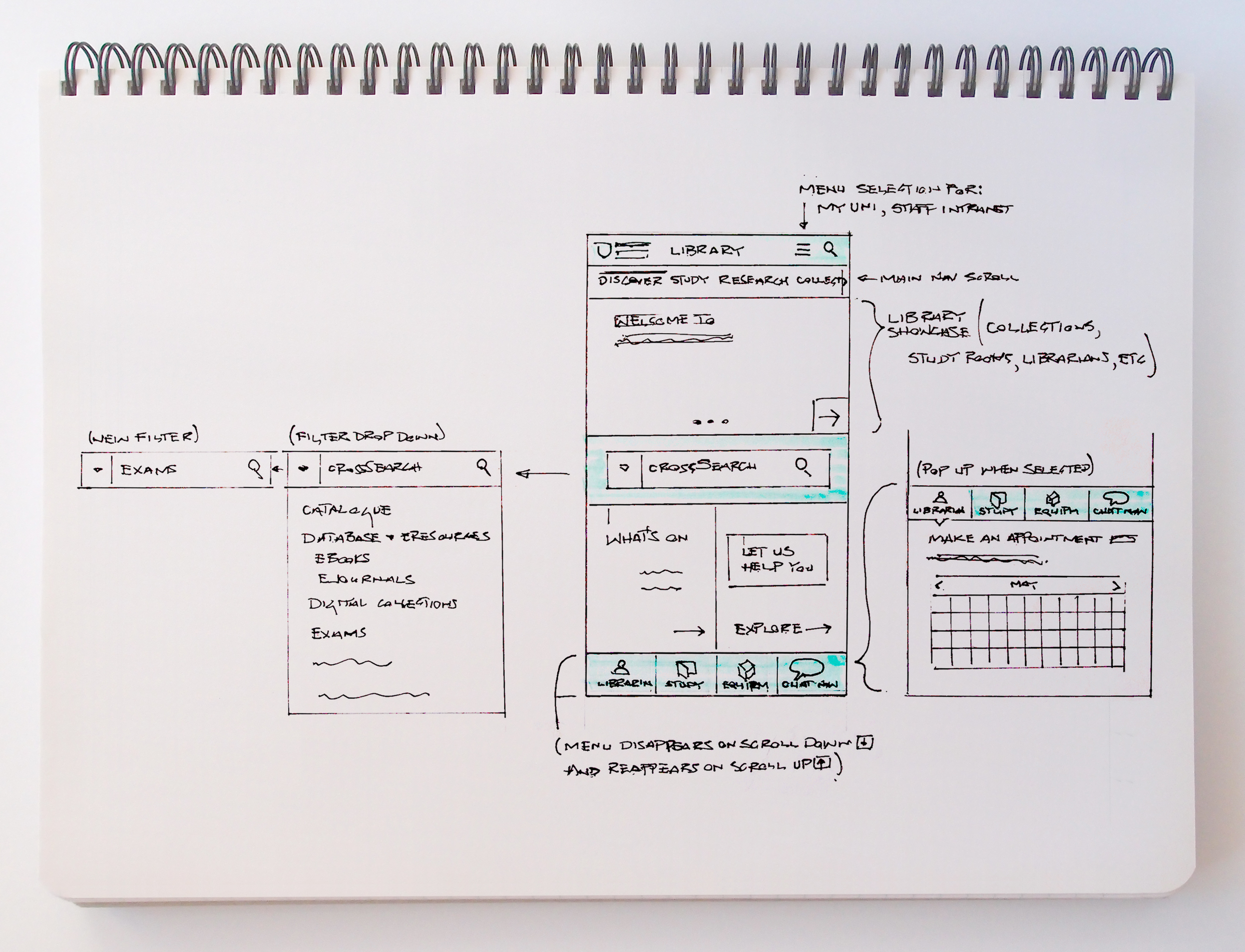
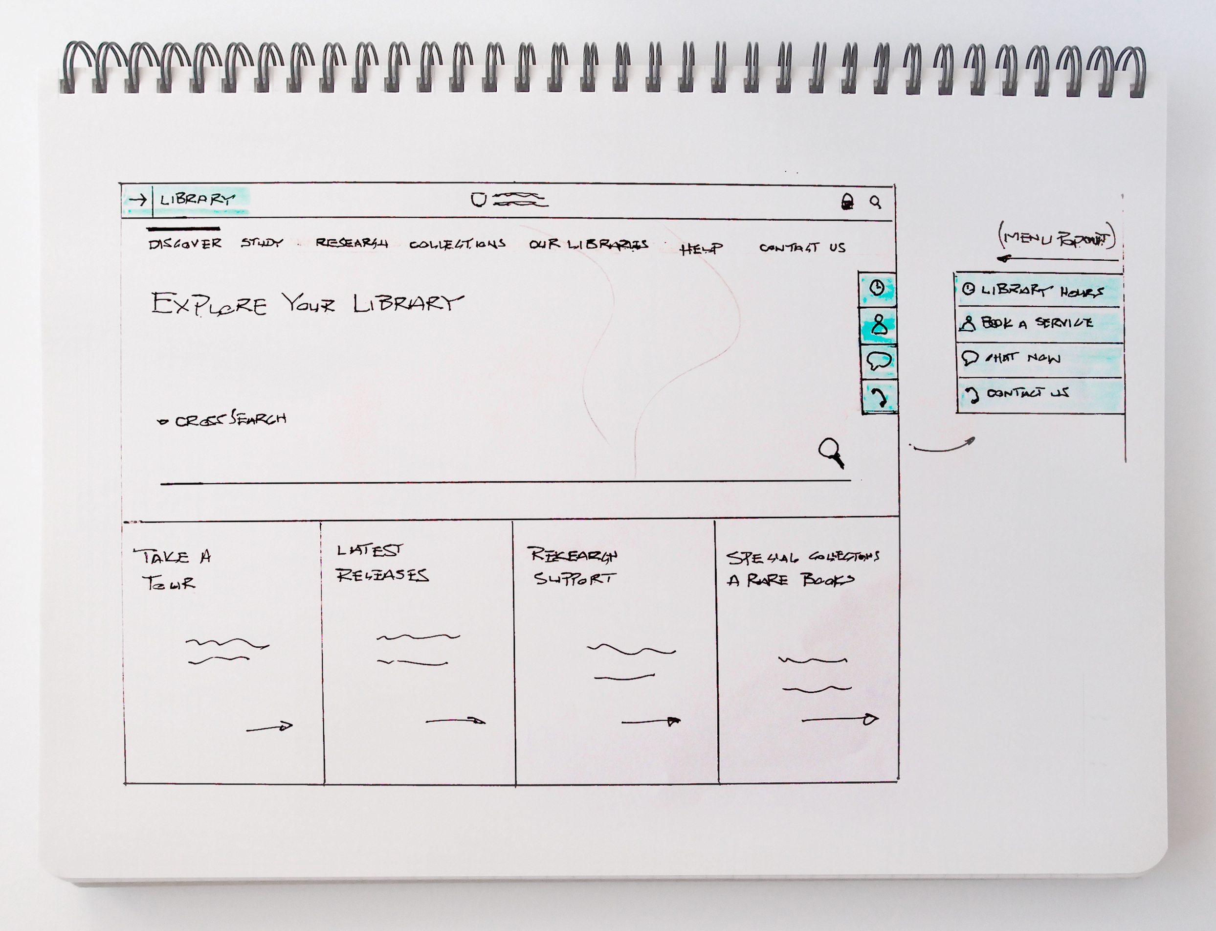
I am a big advocate for working lean and sketching quickly. I began with rough sketches and worked through the user flows informed by the journey maps.
I worked closely with the developers to clearly understand the limitations of existing frameworks so usability could be maximised
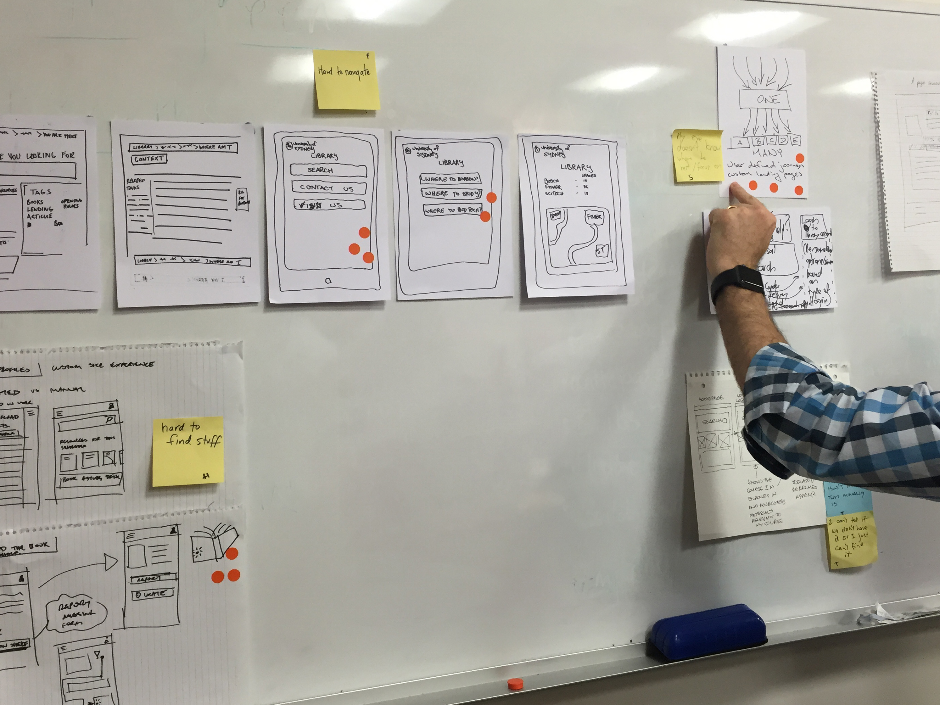
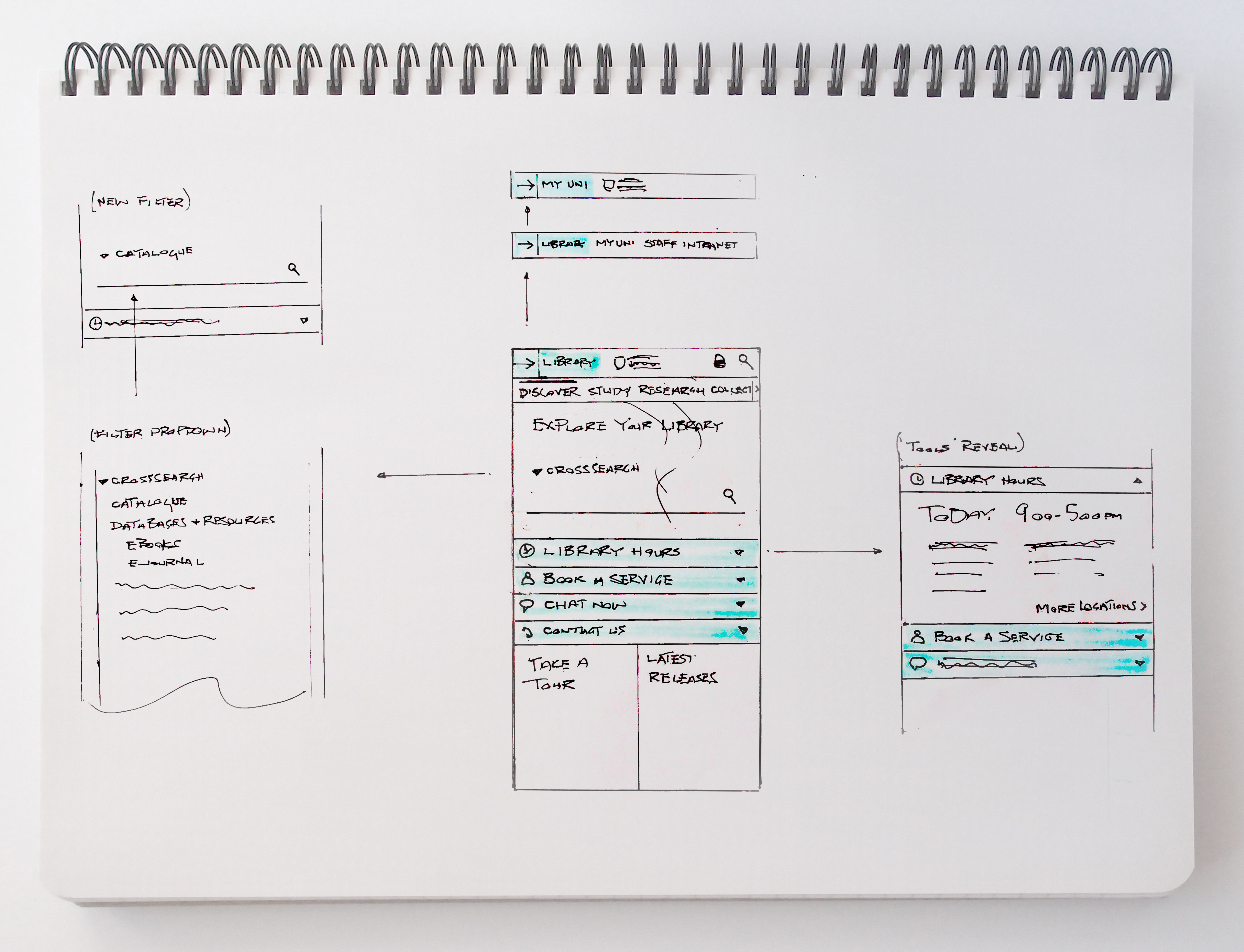
Sketch refinement
Sketches were refined and five different designs discussed with the client which were narrowed to three.
Sketching other viewports
While designing with a mobile first approach, I continually sketched other viewports to identify any responsive issues that could occur.
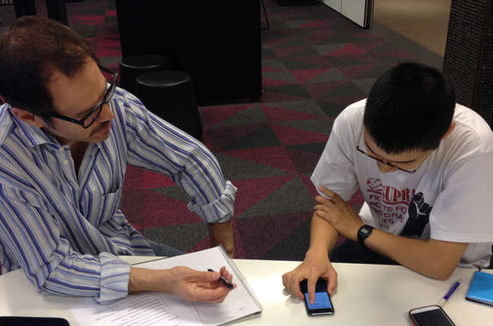
Exploring multiple designs and testing shallow lo-fi prototypes to maximise feedback and identify preference
Clear direction for future iteration
I identified key design differences including tools, main navigation and search functionality. Three significantly different designs (A/B/C wireframes and prototypes) were tested to maximise participant feedback, plus clearly identify design preference in the initial round of testing.
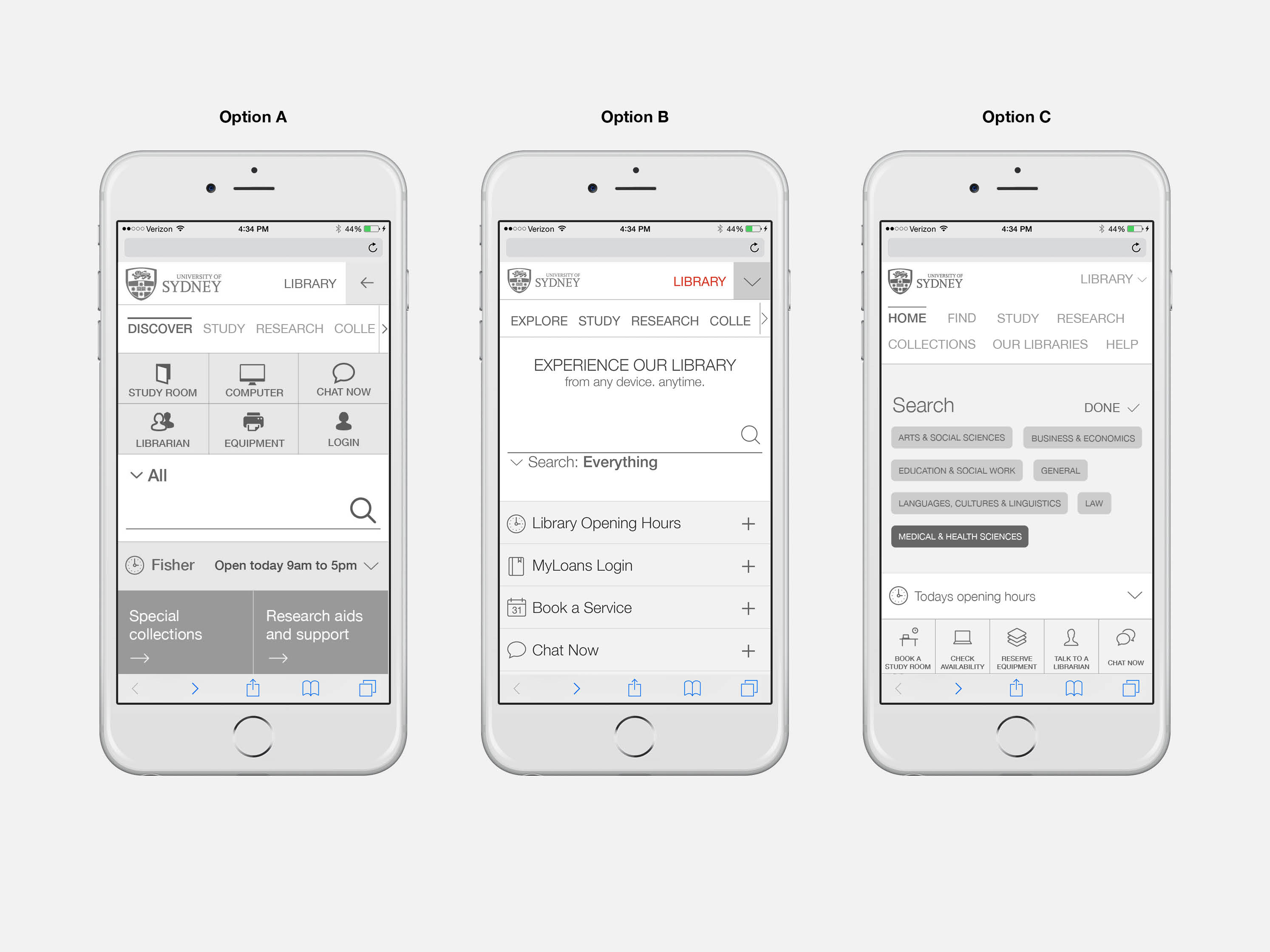
“I don't like how the search field moves down when I want to specify what I am looking for”
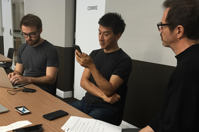
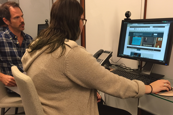
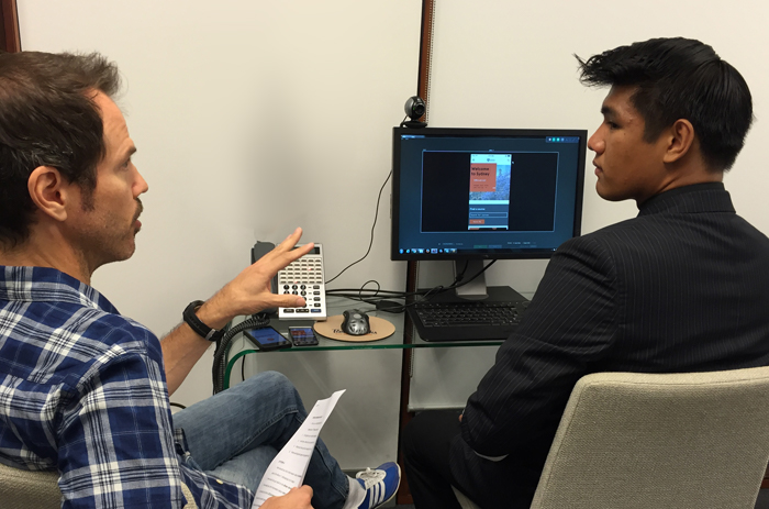
Usability testing and lean findings
A lean findings report was produced to inform stakeholders of the results and review the suggested iterations so all team members involved had an agreed direction for the next phase of design.
Option B (prototype) from this round of testing was the clear winner. The majority of participants preferred this option for it’s simple search functionality, plus the location of tools and being able to book services contextually.
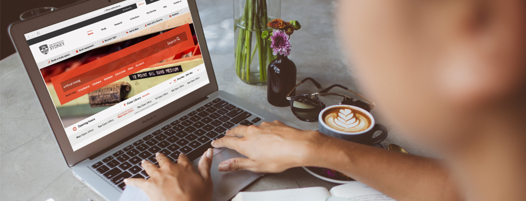
Informed design iterations and more testing with hi-fi colour prototypes across both mobile and desktop
Refining and validating
Iterations based on participant feedback from the previous round of testing were implemented into hi-fi colour prototypes which included all primary pages to be delivered so any additional iterations could be made before moving the final designs into development.
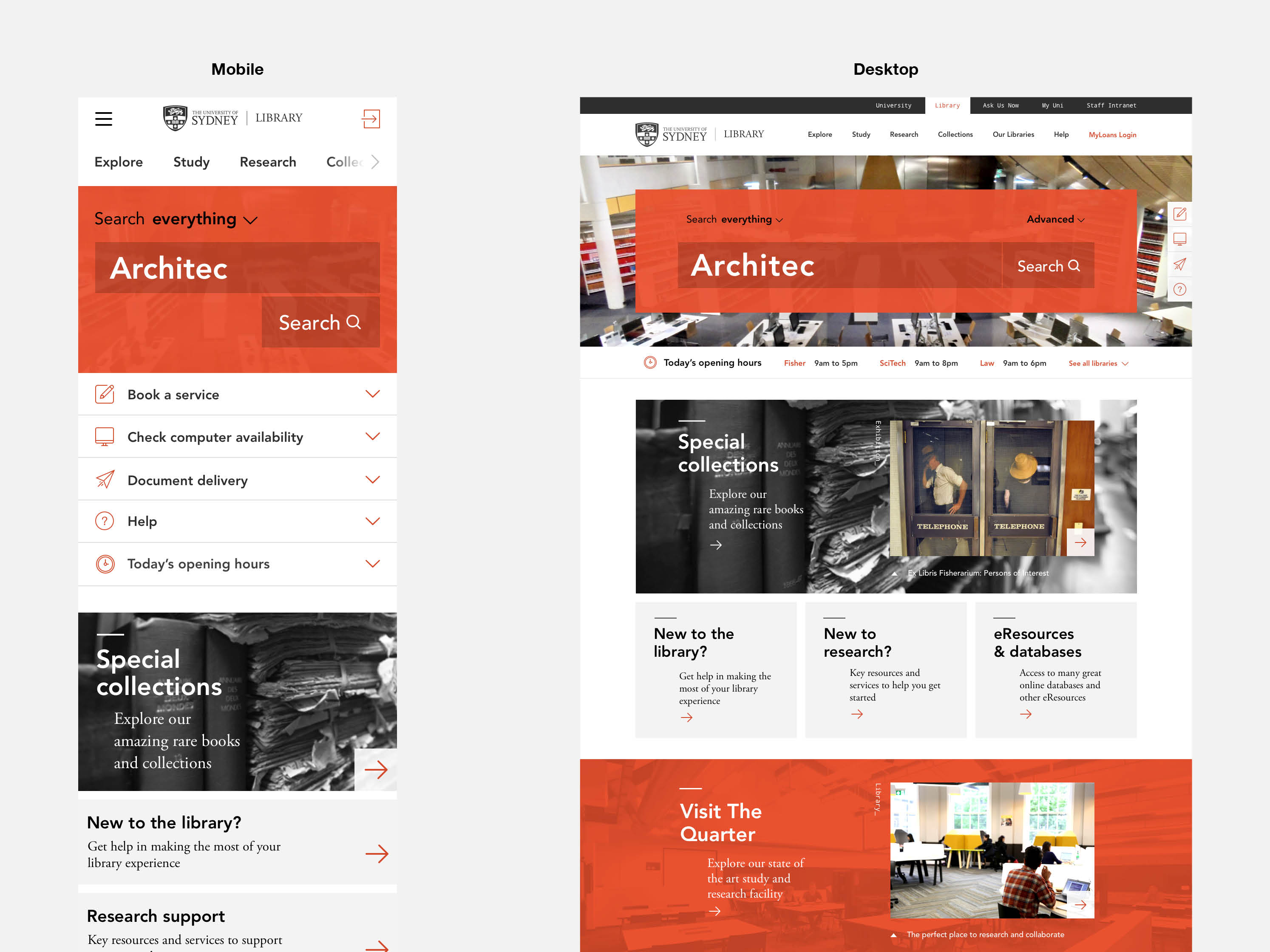
Final detailed designs and implementation
18 responsive interface templates
I worked with the UI Designer and supervised the final detailed designs, plus I provided Quality Assurance (QA) with our developers including integration, testing and deployment.